Wednesday, 29 June 2011

Time to put pen to paper … as sales boom!


E mail, text and Twitter were said to be the final nails in its coffin.
But as with Mark Twain – a great exponent of the art – reports of the death of letter writing have been greatly exaggerated!

Increasingly, people are foregoing the gratification of instant electronic communication for a slower, more personal approach. Letter writing is experiencing a revival, and the art of saying ‘thank you’ is central to its resurgence.

Retailers across the country are seeing increased sales of mail stationery, including writing sets and fountain pens, as consumers turn their back on other electronic communication channels. 


  • Sales of writing paper at John Lewis have soared 79% year-on-year, with letter writing being seen as part of a wider resurgence in home-made crafts and the desire to create more personalised communication
  • The trend is not just happening for adults … with sales of children’s writing sets also on the up. Hello Kitty products have risen by 62% in the past 12 months at John Lewis 
According to Clare Northwood (Group Stationery Buyer for John Lewis) there has been an uplift in sales of ‘thank you’ notelets alone of 20%. 

Northwood added: “It is easier to ping off an e-mail but it is more meaningful to send a thank you card, particularly if someone cooked for you and has gone the extra mile.”

This mood change is also recognised by Annette Sharp (Director of online retailer, Papernation) who said that parents were seeing letter writing as a way of encouraging their children’s writing skills without it being seen as homework. 

Sharp commented: “I think it is part of a wider hand-made and back- to- basics approach, appreciating the smaller things in life.”

Wednesday, 22 June 2011

Fish and chip shops breathe a sigh of relief as Printed Newspapers still hold their appeal!

Let’s face it; the newspaper industry has seen better days.
Consumers now have so much choice in the way they receive their news.
For some it’s simply a case of Radio or Television.
For others it’s an age of iPads, iPhones and the internet.

So, it was something of a surprise to see the results of a recent LinkedIn poll (instigated by PR Daily) asking how often PR professionals read printed newspapers.

Of the 450 people polled:
  • 71% say they still read a physical newspaper
  • With just over a third (34%) reading one every day
Once again, more evidence to support the print media and pleasing to see that despite all the choice now available people haven’t given up reading the paper all together!

Of course, newspapers are not everyone’s cup of tea … 22% stated that they never read printed newspapers, preferring the on line versions or Twitter, media apps and mobile internet.

The advances in mobile technology does tend to indicate that someday (hopefully not  in our lifetime) newspapers might seem like an antiquated echo from the past. For many people that will be a depressing thought as they still like a good thumb through The Times, The FT or (dare I say it) the Metro.
 
Train carriages will never be the same again as we reject the familiar rustling of the pages and, of course, the inky feeling on your fingers! But maybe there will be sufficient diehards … who might even get their own ‘newspaper readers only’ carriage … now there’s a thought!

And, anyway … You can’t wrap your fish and chips in an iPad can you?!

Tuesday, 21 June 2011

Kall Kwik donates Carnival Banners to Westchester House Nursery

Kall Kwik, Farnham has always enjoyed being part of the local community.
Local businesses and individuals come to us for a range of printing requirements. In turn, this has led to the development of long term business relationships …

In recent times we’ve been working with Westchester House Nursery School, based in Anstey Road, Farnham. And, as you may have seen in the Farnham Herald (17th June edition), we’ve agreed to donate two large five meter banners to help decorate the open-top double-decker bus they plan to hire for the Farnham Carnival on Saturday 25th June 2011.  


Lesley Hurst, deputy nursery manager said: “Westchester House Nursery in Farnham find Kall Kwik a very reliable and friendly service, and we are really excited they have agreed to supply Westchester House Nursery with marketing banners to go on our float for the Farnham Carnival in June. We look forward to seeing their high quality of work as always.” … thanks Lesley for those kind words!


We have also recently been involved with several charities in the area such as the ‘Love in the Box’ appeal at Christmas and Action Medical Research.

Colin March (our Centre Owner) will be cycling from London to Paris in July to help raise money for the two charities.

Colin says: “This is a huge achievement for us as we are a small team of just seven staff. We are in great demand at the moment from a large client base which includes charities such as The Phyllis Tuckwell Hospice and Farnborough Air Sciences Trust.”

So, please do support your local carnival and keep an eye out for our banners!
     

Friday, 17 June 2011

CMYK … Possibly the best four letter acronym ever?

CMYK is probably one of the better known four letter acronyms outside of its own business sector.
From early childhood we are made aware that Cyan, Magenta, Yellow and Key (black) are more commonly known as CMYK.

These are the four colours of ink used in the traditional method of printing hard copies of images, called offset printing.  

The three colours plus black, roughly correspond to the primary colours, from which many mixed colours can be made across the visible spectrum.

Of course, CMYK cannot reproduce any colour that exists in the world, but it can produce a great number. It’s impossible to match things like a parrot feather, rose petal, or oak leaf … but the colour system can get remarkably close.

  • CMYK is capable of creating so many different colours because we not only use inks in varying ratios to each other, but with a varying concentration – noted as a percentage. These combinations create colours that span the spectrum in hue (what we think of as colour) as well as tone, or intensity.
  • It is important to note, however, that CMYK is limited by outside factors including the qualities of the paper, the integrity of the ink and the halftone dot size.

 
Now that we live in a digital age, much is made of the conversions between CMYK colour and RGB (Red, Green, and Blue). Here’s a technical bit: RGB colour varies light, instead of pigment, to achieve the visible spectrum.

We encounter RGB colour in monitors that actually emit light at a certain wavelength, rather than reflect existing light. For this reason, the screen image of a picture in RGB will never match the printed image in CMYK. And, although these colour systems are related, one colour cannot directly convert to another.


Wednesday, 15 June 2011

Are you confused about VAT on Print?

If you’ve answered ‘yes’ then don’t worry, you’re not alone … even the VAT officers find printing confusing!

VAT on print is without doubt a minefield.
Sadly, here at Kall Kwik we don’t make the rules regarding VAT; if we did then the world of printing would indeed be a simpler place for everyone!


If you are unsure about what attracts VAT on print and what is VAT free then please do contact us for some advice … Before the start of your printing project. I say that for the very good reason that it could mean the difference of paying or not paying a whopping 20% extra!    

And, do remember that if you are a small business, Charity or in Financial Services then you might not be able to reclaim the VAT.


As I said at the outset it is a complicated area, but here are some simple rules that may help you …

  • All stationery items (Letterheads, Business Cards, Compliment Slips etc.) are subject to VAT
  • Advertising material (Leaflets, Flyers etc.) is generally exempt, but any tear off portion or area that needs to be filled in by the recipient is subject to VAT
  • Books are generally exempt along with Newsletters and Brochures
  • Ring Binders, Tabbed Dividers and Point of Sale material are subject to VAT
  • Banner Stands, Outdoor Banners and Pop up Stands are all subject to VAT

There are also some rules regarding the use of personalised material …. If you need help, please do contact us, we’re here to help you …

Thursday, 9 June 2011

What is the Right Font Size?


I have previously written about type fonts and the need to get them right in your printed materials.
In particular that article looked at the three key business criteria of:

What is your Goal?
Legibility
Readability

Legibility and readability touched on the use of type fonts, but that is an area which is deserving of a more in depth look ….

The right font size for any given printing project can vary widely but it is crucial in determining whether your marketing material gets read or not.

And, to revisit your ‘goal’ it is to capture the reader’s attention and offer information in the simplest way possible.

Guidelines to follow in selecting your font size:

Generally you should select your font size based on the amount of words you have and the space you have to fill them.

For brochure printing and other marketing material, the fonts that capture the most responses … don’t go under 10 point. Smaller font sizes are harder to read so it’s best to stick with a size higher than this, if possible.  
  
Headlines are best at around 12-14 points for maximum effectiveness, whereas for body copy type fonts under 12 point work well – as a larger size can tire the eyes.   

  •  Use bigger type in areas that need emphasis  such as headlines or quotes
  •  Be consistent in your font size use … if your body copy is set at 11pt, then stick to it

The size of your font is as important as the style of font chosen and it is critical in drawing the reader’s attention longer than a split second.

And, of course, it is always advisable to discuss your requirements with your Printer!

Monday, 6 June 2011

Why has Digital Printing become so popular?

That is a question often posed.
And, as a follow up … When do I need to use digital printing?

In effect there are three main reasons driving the growth of digital printing, which has resulted in many more people selecting the digital option …
  • Lower Quantities: In our world of change it is definitely true that information now needs to be revised constantly. In turn this created a trend towards print users reducing quantities ordered so they can choose to change or update information as needed. Smaller print runs reduce waste, so any extra costs can generally be offset 
  • Faster Turnaround: Our world also requires a culture of ‘on demand printing’ … in effect it is something that technology and the print industry has created! The computer revolution has reduced the turnaround of a digital job to two to three days with many being done on the same day or overnight!
  • One to One Marketing: This is still am evolving development, where Variable Data Printing demands an image or text change from impression to impression. This is still a growing market which can be most effective with personalised marketing communications.
There are many other reasons why users select digital printing for more of their needs, but these three are the main factors at the current time.

Products printed digitally can include: 
Postcards, Brochures, Posters, Flyers, Invitations and Sales Sheets.

But there are also limitations to digital printing.
Here at Kall Kwik we are always happy to talk to our customers regarding their best print options.

Thursday, 2 June 2011

Making a ‘pen and ink’ about the pen!


I recently wrote about ink and all the wonderful applications used by it.
Seems only fair that I also ‘pen’ a few lines about our old friend the Ball Point Pen ….

The Ball Point Pen, or more commonly referred to as a Biro, was invented by Laszlo Biro – a Hungarian newspaper editor.

The pen came on to the UK market after WW2.
Its arrival was warmly welcomed in schools which had previously used a special brew of “school ink”, which was a disgusting concoction that was poured into the desk inkwell.

Students then used a school pen with disposable nibs or, if you were lucky your parents bought you a fountain pen and a bottle of Stephenson’s blue-black ink!

When the Biro became available, many children were not allowed to use it as teachers believed that handwriting would suffer. And there is a modicum of truth in this for although the ballpoint pen enables you to write much more quickly, neat formation of letters is not as easy as with a traditional nib.

Do we now write much more than previous generations?
The Biro has made writing quicker and easier and you can carry one around without worrying about ink leaking everywhere. It’s better than a pencil for most purposes and is just about permanent.

Will new technology and electronic notepads slowly replace handwriting?
I hope not …. I like my Biro!!

Wednesday, 1 June 2011

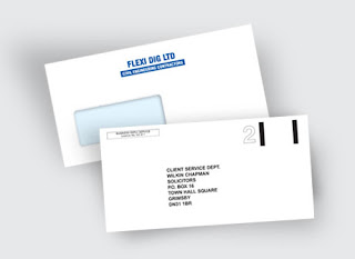
Top Tips for the Design of your Envelopes


I’ve previously written about the need to make your Envelopes a ‘Shop Window.’
But I make no apology for revisiting this subject as envelopes can make such a difference to your business and of course your brand reputation!
  
Envelopes are the wrapping paper of the stationery world.

They package your invoices, letters, statements and estimates
They represent your brand through the mail

And, that’s why it’s vital to spend time when designing them; in particular there are 4 key components to remember before you hit the drawing board.    


1. Use standard sizes – Before you even start to design your envelopes, you should decide what size or sizes you plan to create. You can technically use any size you want, but it is smart to create one or two standard sizes that will be eligible for standard postage rates. This is the best way to make sure your envelopes will be functional and stylish.

2. Incorporate color – White is the standard for envelopes everywhere, so a little color can go a long way in making you stand out against the mass of mail out there. If you want to give your business an edge with stationery and branding efforts, print your designs on a colored envelope or incorporate color into the design.
A splash of logo or graphics, or just a little color accents to accompany the text will really help your envelopes get noticed, and assure they will be opened.

3. Keep your branding consistent – If you already have vibrant letterhead and effective business cards, try to make sure your branding flows smoothly and is consistent with each element of your printed marketing campaign. You don’t have to make the designs identical, but make sure everything aligns with your envelopes.
Whether it is color scheme, design theme or style or just the font and fixtures, consistency will create the impression that you are stable and reliable, so make sure your envelopes are in sync with the rest of your collateral.

4. Add return envelopes – If you didn’t notice, nearly all professional businesses and direct mail inquiries that are sent to you require return envelopes when necessary.

If you want your customers to connect with you and it is relevant for them to do so via mail, then get return envelopes printed and include them in the mail you send. You don’t want these to look like the primary envelopes you are designing, but you do need them if you expect your target audience to mail something back to you. If not, then don’t forget to include a website along the back of your envelopes or some instant form of communication.